Bootstrap Alert Popup
Introduction
The alerts are from all of these components you even don't think of till you truly get to really need them. They are taken for providing quick in time comments for the user having interaction with the site hopefully directing his or hers attention to a specific direction or evoking specific actions.
The alerts are most often used together with forms to give the user a recommendation if a field has been completed wrongly, which is the proper format expected or which is the condition of the submission just after the submit button has been clicked.
As most of the elements in the Bootstrap framework the alerts also do have a well-kept predefined look and semantic classes that are used according the particular condition in which the Bootstrap Alert has been shown on display screen. Due to the fact that it's an alert message it's important to obtain user's interest but however keep him in the zone of comfort nevertheless it might even be an error report. ( check this out)
This gets achieved by use of gentle pastel color options each being intuitively been connected to the semantic of the message information like green for Success, Light Blue for regular info, Light yellow seeking for user's attention and Mild red mentioning there is in fact something wrong.
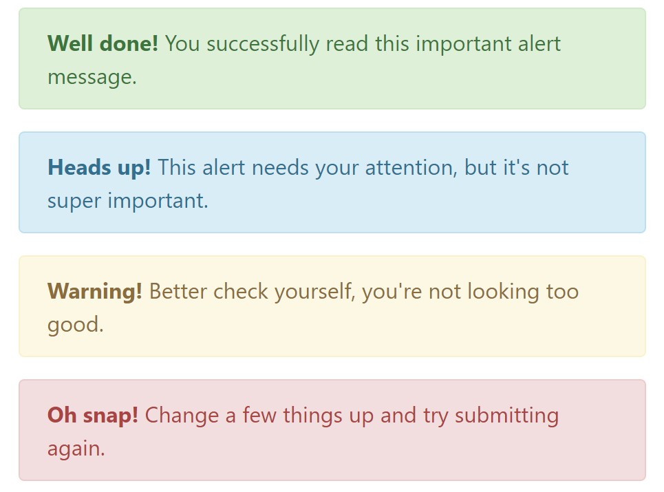
<div class="alert alert-success" role="alert">
  <strong>Well done!</strong> You successfully read this important alert message.
</div>
<div class="alert alert-info" role="alert">
  <strong>Heads up!</strong> This alert needs your attention, but it's not super important.
</div>
<div class="alert alert-warning" role="alert">
  <strong>Warning!</strong> Better check yourself, you're not looking too good.
</div>
<div class="alert alert-danger" role="alert">
  <strong>Oh snap!</strong> Change a few things up and try submitting again.
</div>
Color tone of the web link
It really might possibly not be spotted at a glance but the font colour also is actually following this color scheme as well-- just the colours are much much darker so get intuitively seen as dark however it's not exactly so.
Exact same works not only for the alert message in itself but as well for the links incorporated in it-- there are link classes getting rid of the outline and colouring the anchor elements in the correct colour so they match the overall alert message look.
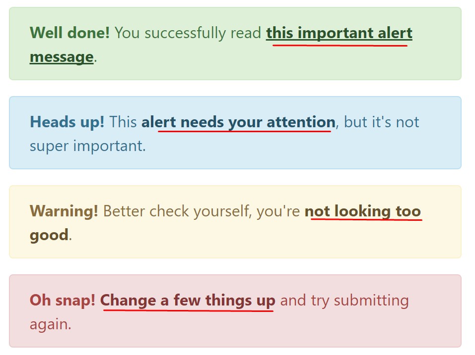
<div class="alert alert-success" role="alert">
  <strong>Well done!</strong> You successfully read <a href="#" class="alert-link">this important alert message</a>.
</div>
<div class="alert alert-info" role="alert">
  <strong>Heads up!</strong> This <a href="#" class="alert-link">alert needs your attention</a>, but it's not super important.
</div>
<div class="alert alert-warning" role="alert">
  <strong>Warning!</strong> Better check yourself, you're <a href="#" class="alert-link">not looking too good</a>.
</div>
<div class="alert alert-danger" role="alert">
  <strong>Oh snap!</strong> <a href="#" class="alert-link">Change a few things up</a> and try submitting again.
</div>
Other information for alerts
A factor to indicate-- the colors bringing their clear meaning just for those who really get to check out them. So that it's a good idea to as well make sure the noticeable message itself brings the meaning of the alert well enough or to eventually add some additional information to only be seen by the screen readers in order to grant the page's accessibility .
Besides links and simple HTML tags like strong as an example the alert elements in Bootstrap 4 can also include Headings and paragraphs for the cases when you desire to display a bit longer content ( get more information).
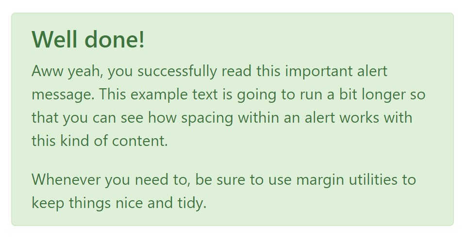
<div class="alert alert-success" role="alert">
  <h4 class="alert-heading">Well done!</h4>
  <p>Aww yeah, you successfully read this important alert message. This example text is going to run a bit longer so that you can see how spacing within an alert works with this kind of content.</p>
  <p class="mb-0">Whenever you need to, be sure to use margin utilities to keep things nice and tidy.</p>
</div>
Decline the alert
You can additionally provide an X icon to dismiss the alert and bring in a cool transition to it to one more time assure the visual comfort of the Bootstrap Alert Example visitors.
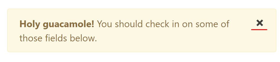
<div class="alert alert-warning alert-dismissible fade show" role="alert">
  <button type="button" class="close" data-dismiss="alert" aria-label="Close">
    <span aria-hidden="true">×</span>
  </button>
  <strong>Holy guacamole!</strong> You should check in on some of those fields below.
</div>
There are four varieties of contextual alert messages in Bootstrap 4 framework - they are titled Success, Info, Warning and Danger. Do not allow however their titles to decrease the manner you're making use of them-- all of these are just a number of color schemes and the method they will be really performed in your site is totally up to you and totally depends on the specific case.
As an example-- if the color scheme of your page uses the red as primary color tone it might be quite appropriate to show the alert for successful form submission in red too making use of the predefined alert danger look in order to better blend with the page and save some time defining your own classes.
Anyway the predefined alert classes are simply some consistent looks and the responsibility for using them lays entirely on the designer's shoulders.
JavaScript activities of the Bootstrap Alert Warning
Triggers
Enable removal of an alert by using JavaScript
$(".alert").alert()Enable termination of an alert through JavaScript
Or perhaps with information features on a button in the alert, as demonstrated in this article
<button type="button" class="close" data-dismiss="alert" aria-label="Close">
  <span aria-hidden="true">×</span>
</button>
Notice that shutting an alert will take it out from the DOM.
Methods
$().alert()$().alert('close')Events
Bootstrap's alert plugin makes vulnerable a couple of events for fixing into alert features.
close.bs.alertclosed.bs.alertInspect some youtube video short training about Bootstrap alerts
Linked topics:
Bootstrap alerts authoritative documents
W3schools:Bootstrap alert tutorial
Bootstrap Alert Issue